We are often asked to come up with a design for a particular space that a client has already found. But things don’t always turn out quite how you might expect. It’s not uncommon for properties to fall through, for various reasons, leaving you with with a restaurant or coffee shop interior design that might not be simply transferable to a new space. So, how do we ensure that our designs not only work for the first space you find, but can also be adapted if your circumstances change?
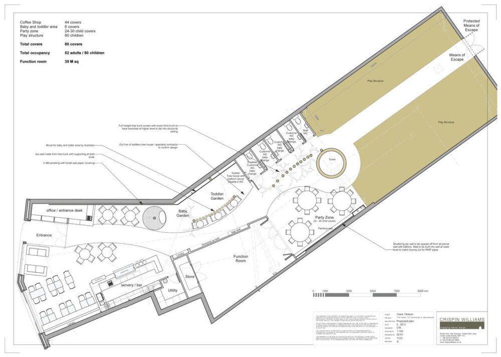
This happened with one of our clients. They had found a large space for their new venture: a children’s play area with a coffee shop. The building was modern and the shell offered us a blank canvas on which to let our design ideas run. The brief was interesting in that it needed to meet two very different needs: one for a fun play space for the kids, and the other for a quiet respite from the mayhem for parents. We designed a cafe at the front (to make sure any bolting children couldn’t escape!) and put the play spaces at the back. To create the sense of playing in a garden we designed different vistas through to the play area and developed rambling curves with grass-effect carpeting. We wanted the space to represent the freedom with which children play, particularly in nature, whilst also keeping them safe and their parents happy.
Here’s our original interior design technical drawing for the play space and cafe:

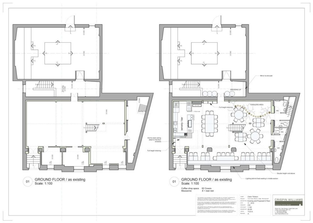
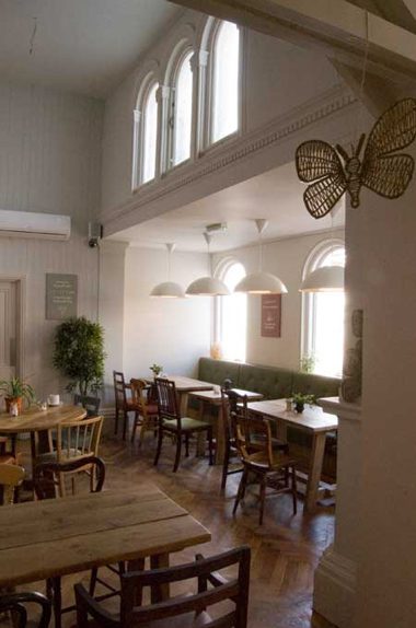
However, unfortunately for our client the landlord of this first space pulled out. Back to the drawing board, and a new space. The new building was an old Masonic hall that had been converted for use as a skiing and snow-boarding shop. The structure and layout were much more traditional, and required a different approach to the design. We created two distinct halves for each function of the space, keeping the cafe at the front as before but having a more clearly defined play area to the back. This historic space offered a sense of character and story that the other building didn’t have, and we made sure the second design worked seamlessly within it.
While the second space was completely different, we were able to retain many of the original elements in our first design, like the different functions within the space, some of the finishings and an idea based around the shape and imagery of a tree. Here’s the second design layout:

This example shows that we may get the same brief for the same client, but the outcome will change according to the shell in which the design is to be realised. Our job is to be flexible, adaptable and resourceful, playing to the strengths of a new space if we are asked to fit a design brief to a different building. We will look for the elements that we can carry over to ensure you get the exact look and feel you are after, whilst also making the best possible use of the space. If a venue falls through we can help you turn a potentially tricky and stressful time into an opportunity for a fresh look at your restaurant or coffee shop interior design. It all worked out brilliantly for our client and we loved thinking of the playful adventures all those children would have. And all the vital calm moments of coffee-drinking their parents could enjoy while they frolicked.
