One of the great things about working with local independent businesses is seeing them grow and expand. And getting asked back to develop an interior design for their next venue is pretty exciting. We know the brands, we understand what they are trying to do, so a second design is all about adapting a new space to this design brief to ensure the venture has the best possible chance to flourish. One of our repeat clients is the Brighton Kitchen Company. We had previously designed the interior for their bathroom showroom, and they wanted us to create an innovative space for their new kitchen showroom.
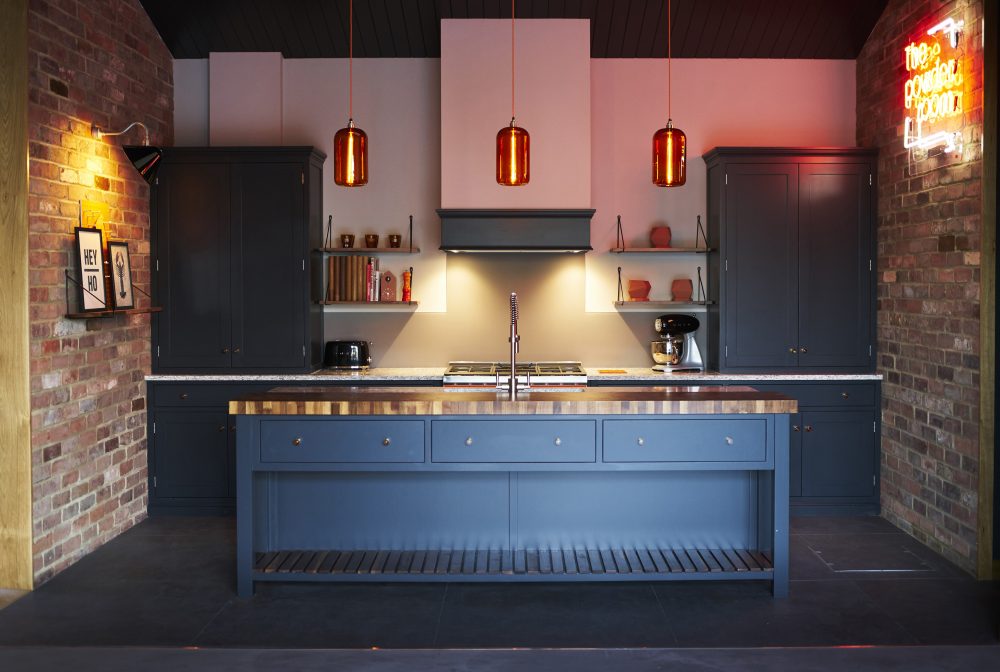
Here’s how we turned a blank space into a dramatic, bold interior that showcases the different kitchens on offer.
The design brief
Our client’s belief that interiors should be design-led underpins their ethos. They create beautiful bespoke kitchens and bathrooms, with an emphasis on quality, craftsmanship and perfect finishes. They believe that just because a product might be familiar (a tap, say) that doesn’t mean it can’t be well designed and play its own part in the overall look of a space. With a focus on the negative space in a room – the things around the larger furniture – they want to let these products shine as much as the bigger pieces. Understanding this, we wanted to create a showroom that wasn’t just a collection of kitchen cabinets and accessories, but a stunning space that really allowed the designs to speak for themselves.
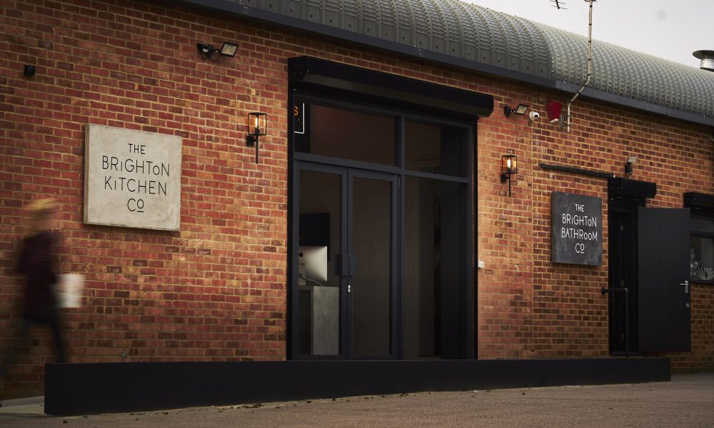
The building itself is a largish unit on a retail park in Sussex. There is very little footfall so the interior had to really pop in photographs and draw people to the site after viewing the website or images elsewhere. We wanted the space to attract interior designers as well as regular customers, and as their bathroom showroom is next door it offers the perfect way for people to explore designs for the two trickiest rooms in a house.
The interior design
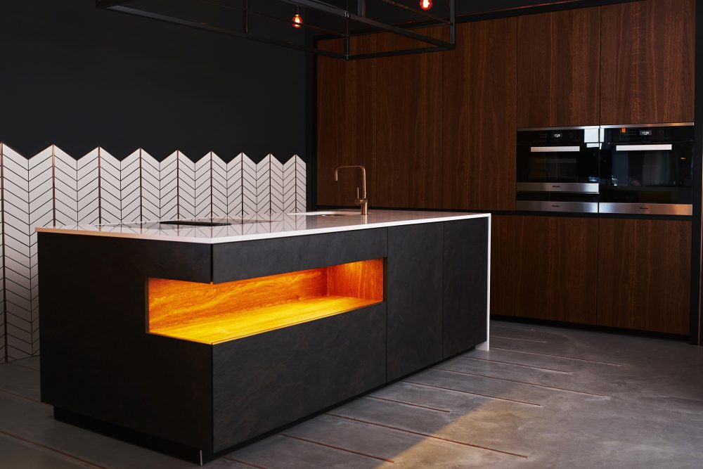
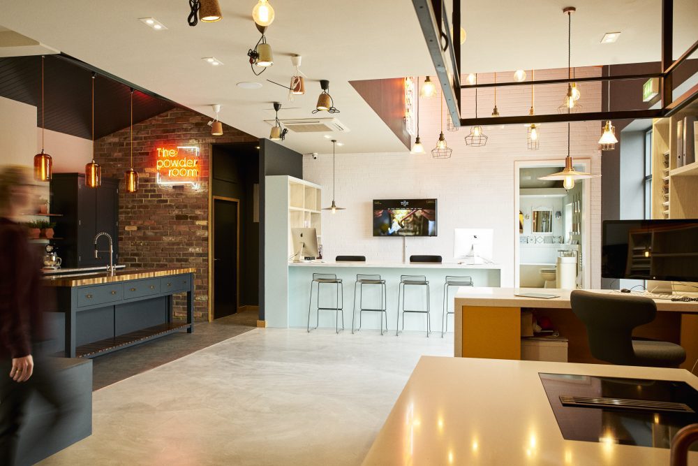
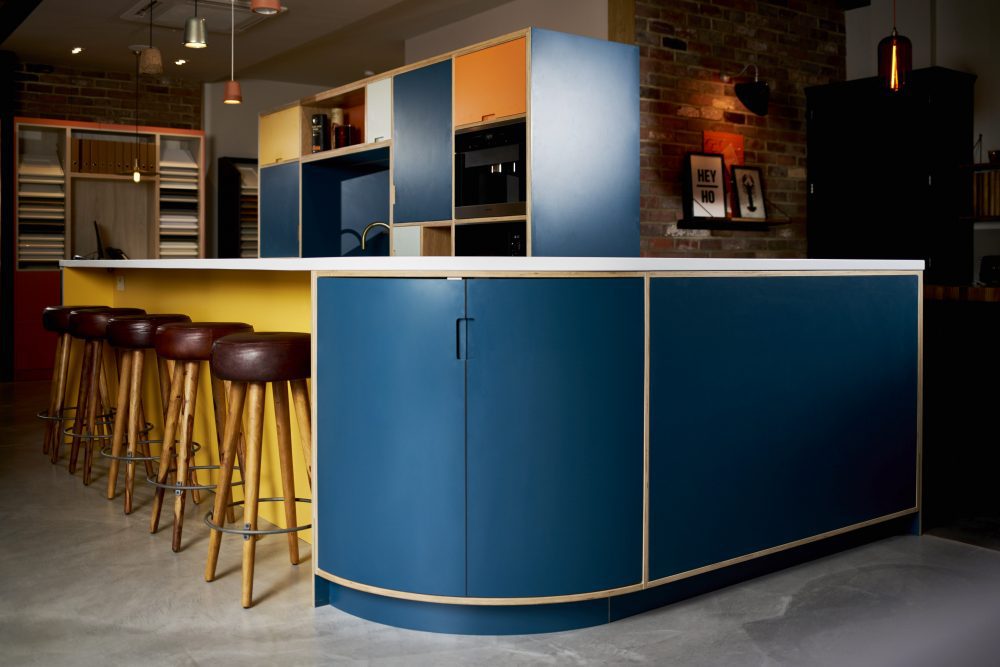
From the outside the space is pretty ordinary so we created a design that would have immediate impact when you walk through the door. We designed four different architectural spaces within the shell, each with a defined design identity: a cottage kitchen, an industrial loft, a two modern home looks. These are not ordinary kitchens and we wanted to keep the number on display to a minimum to really allow the detailing, quality and expert design to stand out.
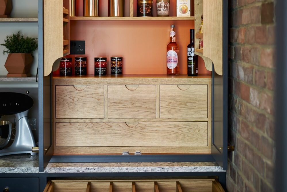
Inside the units in each kitchen you can find examples of the finishes and accessories, so you can hold and feel them as well as see them in situ. We were delighted by how the design turned out. Here are some images so you can see for yourself how we divided up the space, and how stunning the kitchens look.
And if you would like us to help you with an interior design for your showroom, or any other business, do get in touch.
