Earlier this year we asked by Seed in Brighton if we help them with making their office feel more like theirs. They had moved into the space a while back and did what is commonly known as a white out. This is when you make everything white before starting to work some colour back into your interior. A white out helps you understand the space and results in a lighter space but on the downside it can feel cold and impersonal.
The design brief
This was similar to a lot of design briefs I have received for office designs. Office workers have more options these days for working from home and so the office environment needs to feel more comfortable and engaging. As well as applying the company branding to the space it was important to make the space feel more warm. We also used the updated layout to help zone the desk spaces from collaborative to individual desks for workers that need to focus alone.
Adaptive Office Design
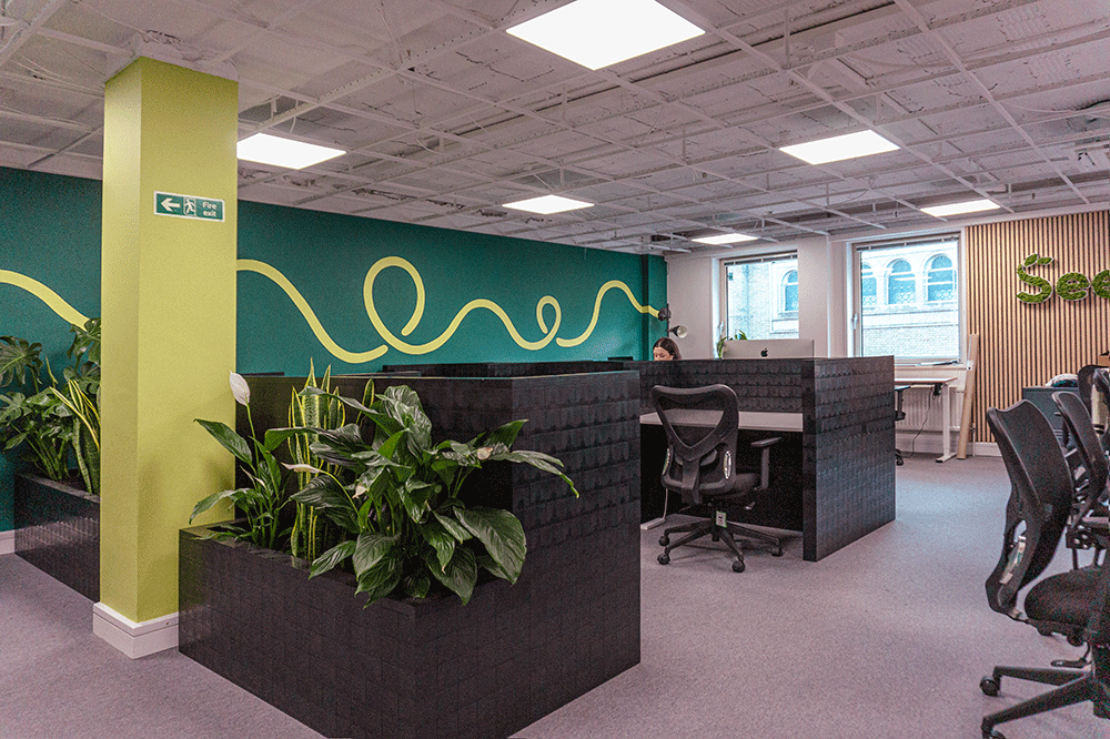
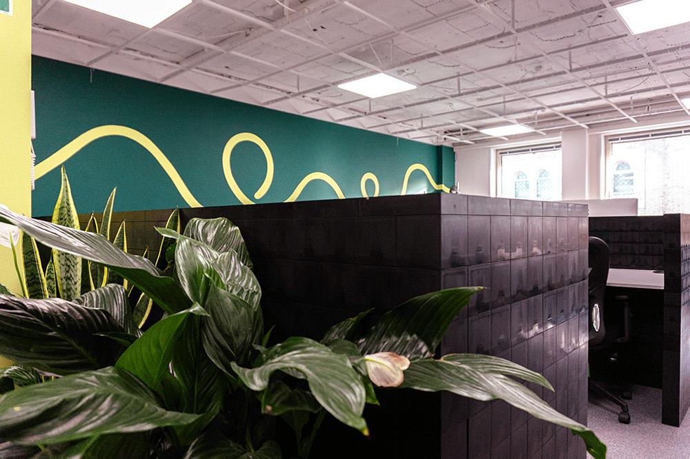
A big part of the brief is to make sure the office layout can adapt to the changing needs of what is a growing business. Desks are naturally easy to move around but partitions can be harder to move depending on what they have been constructed by. We navigated this need by using a block system we have used once before. We used the Morph blocks to construct a shop counter base for Winchester University.
Bring the colour
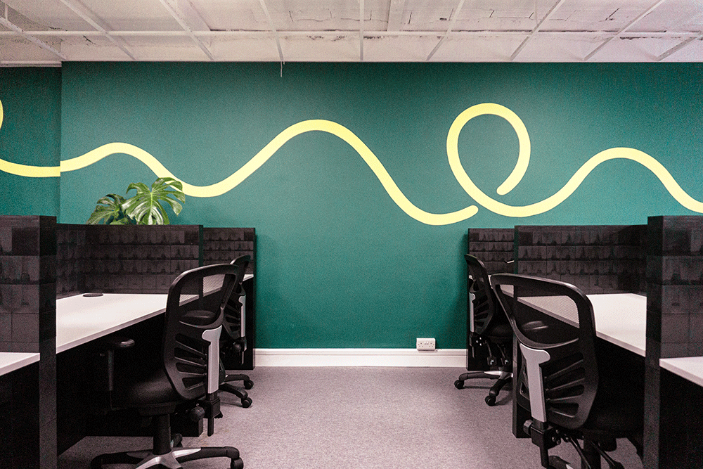
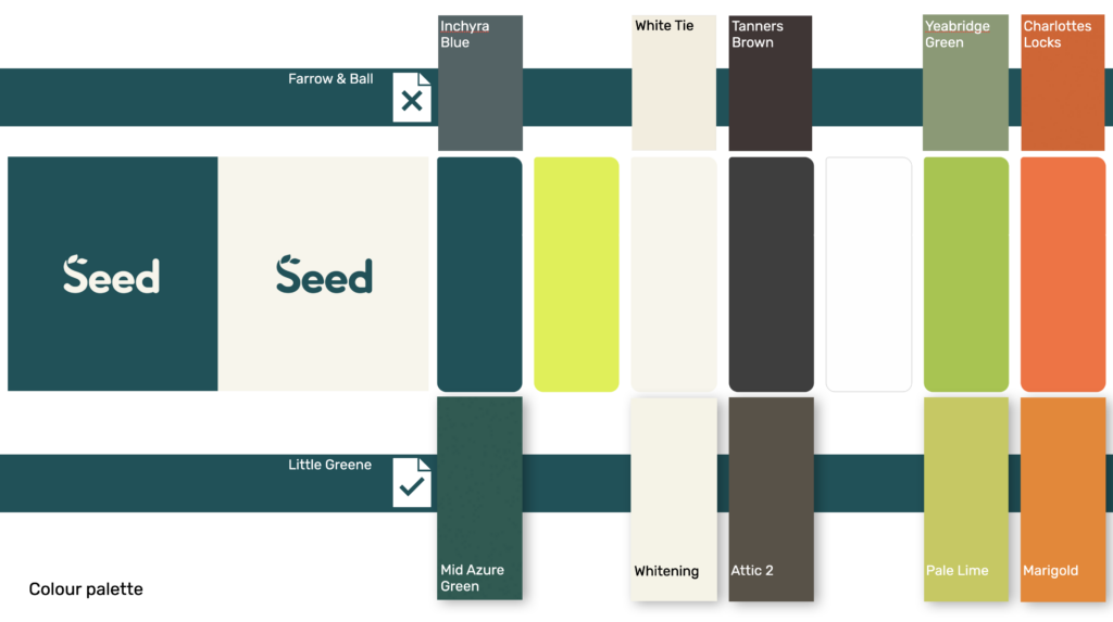
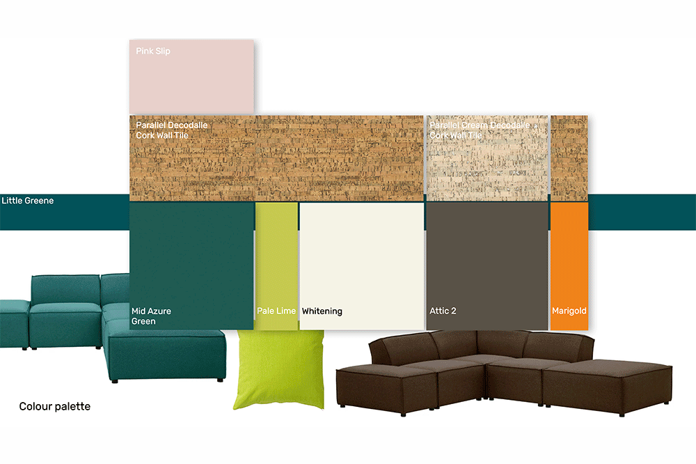
An important part of the process was the colour palette. Seed already had a good set of branding guidelines that they use for their website and presentation work etc… It was our job to make sure the office environment followed suit and anyone visiting the company had a consistent sense of being in the right place. Our approach to colour palette was to look at which paint finishes best matched the companies own look and feel. It should be mentioned here that the colours not only have to be a reasonable match they need to feel right for the space. In our case Little Greene were the clear favourite. We then went on to bring in some other finishes that would work the the chosen palette.
The Board Room
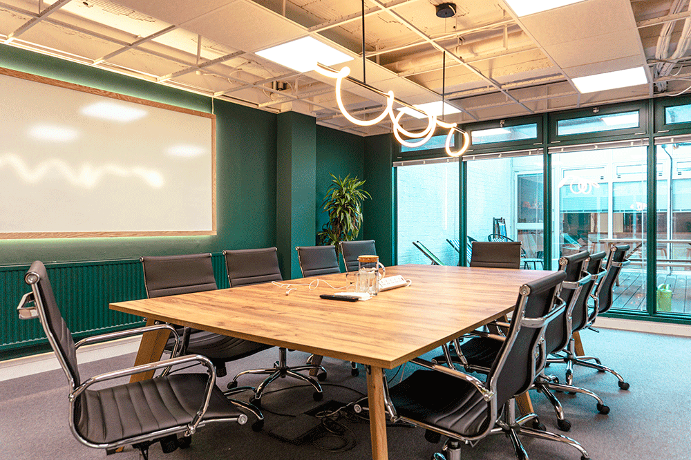
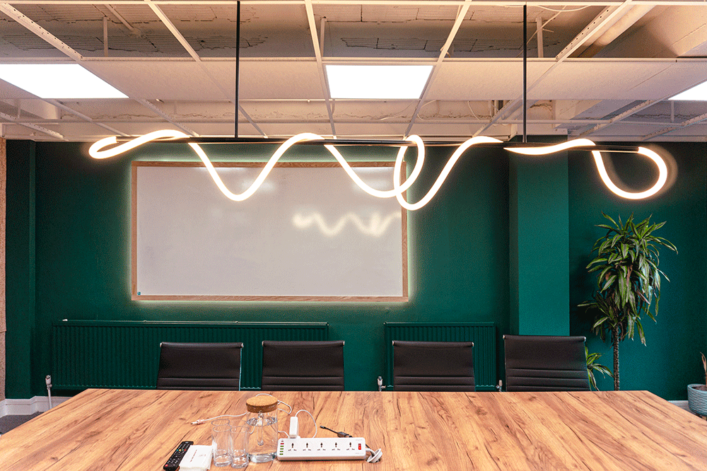
The board room interior design is a condensed version of seed’s branding with colours inline with their colours and a pendant light that reflects the scribble that is also within the branding guidelines. We upgrade the white board with an LED halo and replaced a red framed screen with something more in keeping.

If you are thinking about updating your current office space or looking to move into a new space and want to talk through the ins an outs of your interior feel free to give us a call.