Over my career I have designed a lot of exteriors to buildings and most of them have involved signage design. Signage design is a delicate art and over the years we have learned by trial and sometimes error that less is often more.
Working with a graphic designer
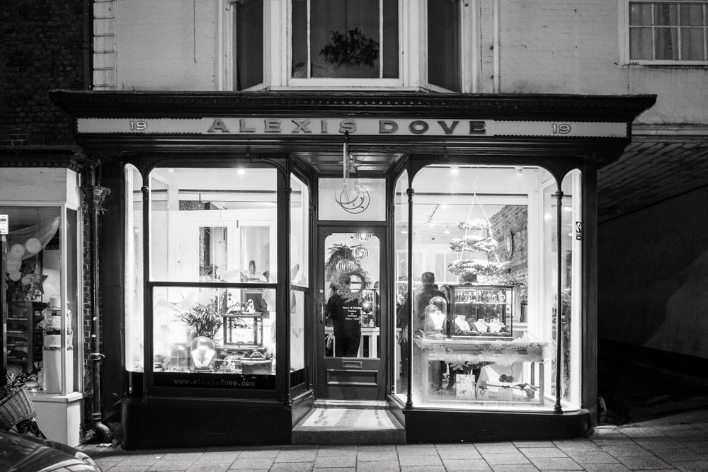
At Engaging Interiors Ltd we believe in using the right tool for the right job. Employing a graphic designer is an important part of getting your signage right. The right graphic designer will be an important contributor to how your sign will look. On successful projects the graphic designer will work hand in hand with the interior designer.
What have we learnt over the years
Firstly there is the temptation of trying to say too much with the exterior of the building. Over the years we have learnt that potential customers only need a general understanding of what you have to offer to take a closer look inside. It is not necessary to explain everything you do.
Second thing to be wary of is repeating the same message too much. Customers will know what your venue is called quite quickly and only need to be told once or twice.
Case Studies
In this post we are going to look at three good examples of signage design we have worked on in the past and explain why we think they work.
Capsule Records
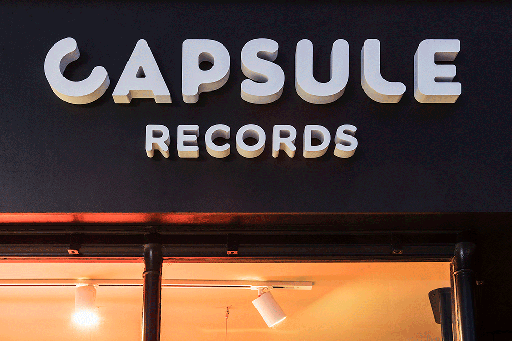
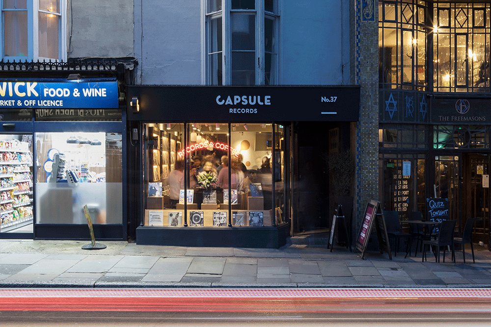
Capsule records is a good example of collaboration between an interior designer and a local graphic designers of brighton Good Noise. We worked together throughout the project and evolved all of our separate elements while communicating with one another.
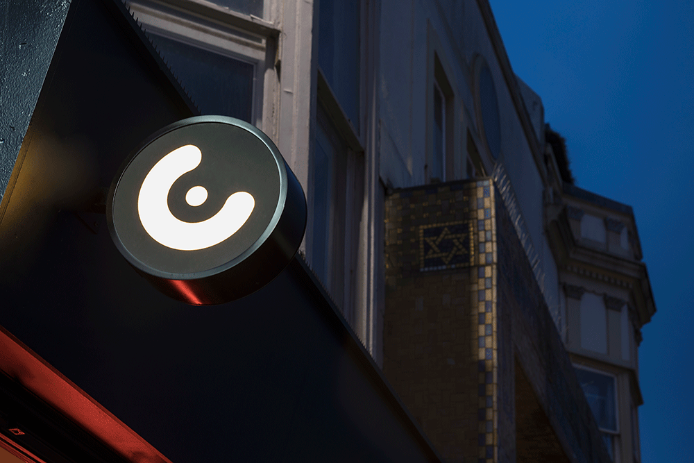
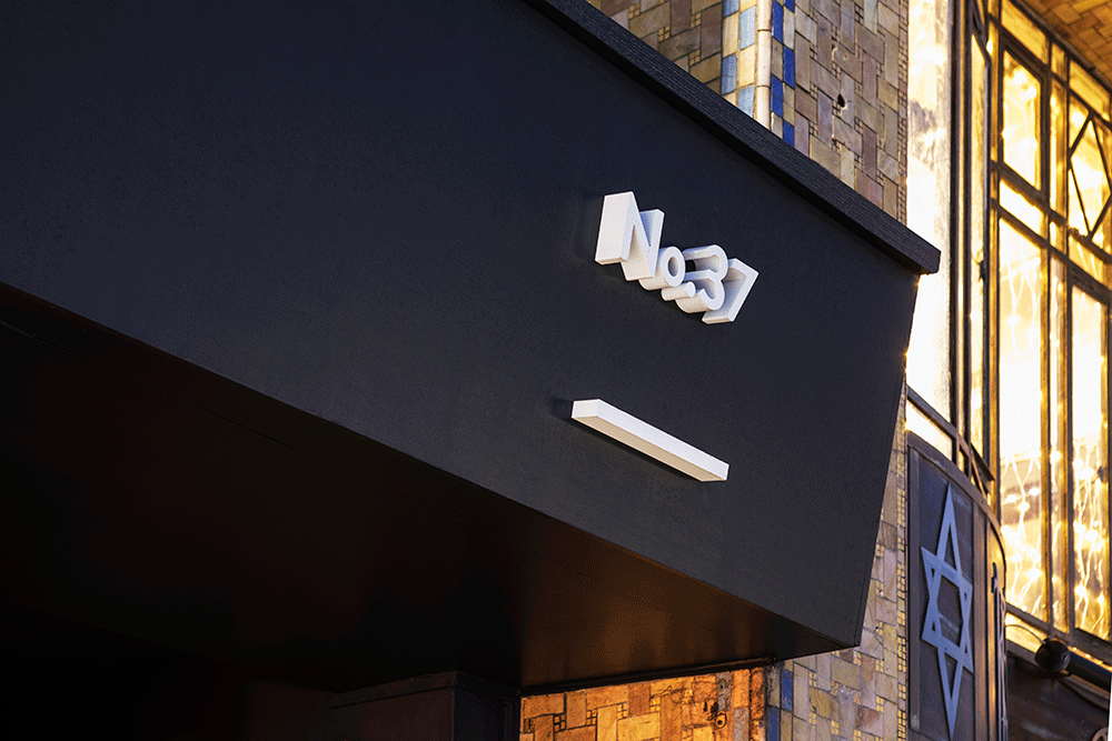
The exterior signage has been done simply and comprises of 3D lettering that is fixed to the nearly black (dark navy blue) fascia. There is also a projecting sign that is internally illuminated.
Chozen Noodle | Excel
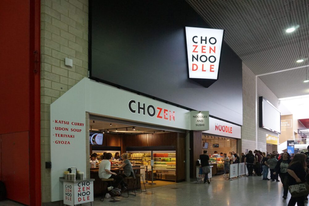
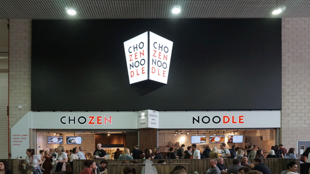
The Excel Centre in London is the largest exhibition space in the capital. When people visit the Excel Centre they generally need to eat quickly so that they can get back to the exhibition spaces. Part of that decision process is choosing where to buy your food. With that in mind we designed Chozen Noodle with the largest internally lit sign we in our interior design history. It is at a good height and can be seen from a good distance. We have also added smaller scale signage text that explains the main food types sold for customers to read and understand as they approach.
Chasing Rabbits Coffee Shop
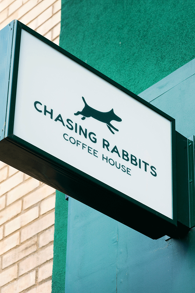
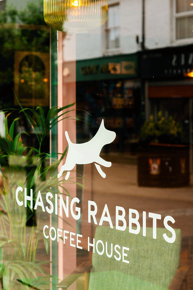
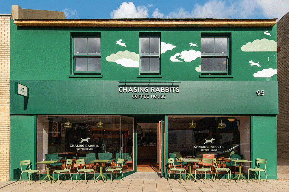
Chasing Rabbits is a Hove based Coffee Shop. We worked with them to turn an old betting shop into dog friendly venue that serves to good people of Hove. We also worked with Good Noise for this project and with this site we designed two murals. One of the murals is on the exterior at first floor level. As you can see from the image below it is a simple extension of the main signage icon of a dog jumping. The mural is softer than an internally lit sign and helps set the scene for what is to come in store. The rest of the signage is awaiting an awning which will be set below the fascia sign and will be full width.
To us signage design and the exterior look and feel of a site is one of the most important aspects of a project. If you think we can help you with your project get in touch via our contact page.