Last month saw the opening of another of our coffee shop chain interior design projects: the fifth site for Josie’s. It’s so satisfying to see how this Hampshire-based independent chain is thriving. And it’s down to a magic combination of the team’s hard work and expertise, a great offer and an interior that gives customers a fantastic experience.
We’ve written before about the process of rolling out an interior design for multiple sites so today we’re focusing on this specific site. Thinking of opening another venue for your business? Looking to expand your coffee shop or restaurant chain? Discover how at Engaging Interiors we look at both your premises and evolving brand concept to create an interior that works, every time.

Coffee shop chain interior design that’s driven by your site
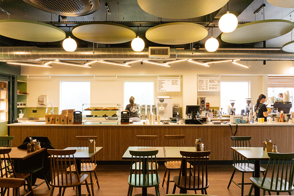
Josie’s is a family-run business serving excellent food and coffee to customers across Hampshire. Their fifth site is an old bank, which had a concrete floor and ceiling and lots of glass. Not the ideal scenario for an inviting, comfortable coffee shop. But we knew how to make it work.
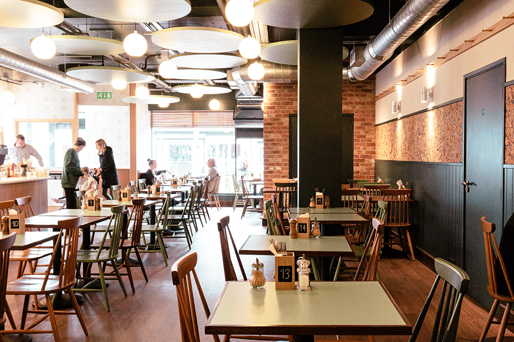
One of the challenges was the acoustics. Customers need to be able to talk without raising their voices, and no-one wants to eat, or work, in an atmosphere filled with harsh noise. So we created a design that would soften the acoustics while still staying true to Josie’s brand identity and keep unity across their sites.
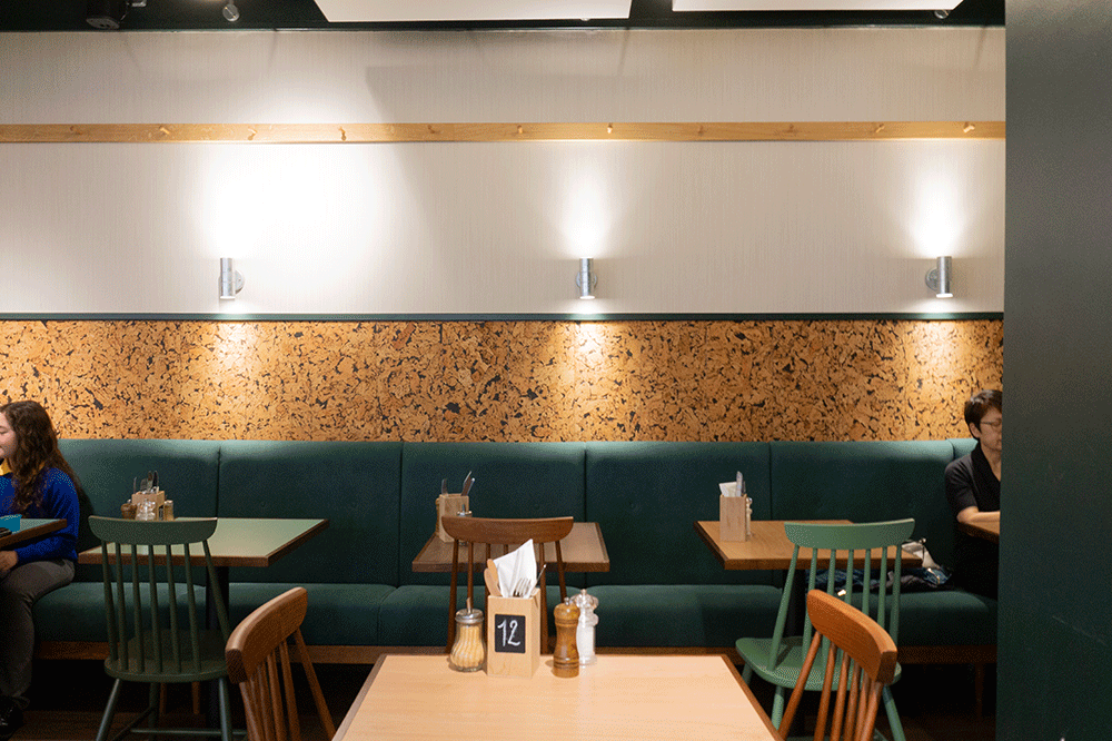
We boxed in some of the glass with plastered walls to reduce the size of the shop front, and installed a circular acoustic panel design on the ceiling to absorb sound. Above the bar/ serving counter (often the noisiest place in a restaurant or coffee shop) we fitted cork acoustic panels, and we used cork on the walls to add more sound-absorbing layers.
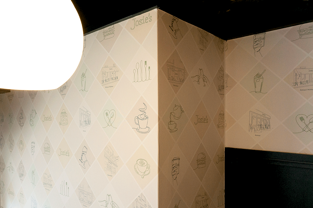
The bespoke ribbed wallpaper and upholstered fixed seating also contribute to better acoustics as well as playing their part in telling the brand story.

Our interior designs are constantly evolving
While every chain wants to keep some consistency across their sites, it’s important to keep an intimate, personal feeling to the space. This is especially relevant for smaller coffee shop chains whose USP is often the fact that they’re not a big corporate chain. Interior designs need to balance these two aspects, as well as responding to each building’s unique architecture.
For this site, we took what we’ve learned over the previous refits for Josie’s and incorporated developments in their brand concept. For Josie’s this new site was a big step forward and a chance to not only maximise the space but to make it as functional as possible, using what we’ve learned about what works for them.

This meant considering what we’ve learned about layout, equipment on the bar, the kitchen, acoustics and general feel of the place.
The result? A beautiful space where customers can hear each other easily and enjoy their food and drinks in comfort. A space that entices new people in and keeps regulars coming back for more. And one happy client.

Find out more about our interior design approach here, or get in touch to discuss how we can help you give your business the best chance of success.