As we mentioned before, we are starting an exciting new series of posts exploring how to design a restaurant. Starting your own restaurant business and need some advice on interior design? This series examining the key elements that make up effective restaurant design is for you. We will explore how to apply interior design principles to make sure your restaurant looks fantastic and functions effectively.
With today’s post we are going inside-out. We will explore how to design a restaurant exterior and make sure your entrance really packs a punch. Interior design is sometimes also about what’s on the outside.
A wise restaurateur once told us: “From 100 yards a customer should know you are a restaurant. From 50 yards they should be able to tell what kind of restaurant you are and what ‘level’.” This should be your guiding principle: customers, whether on foot or passing by in a car, should immediately know what you are. Your exterior must be instantly recognisable and identifiable. You have one chance to make a first impression.
Having said that, some maverick restaurateurs opt to make their exterior as ambiguous and secretive as possible, like Spuntino in London and Flask in Shanghai, a bar hidden behind a vintage vending machine. Spuntino (see pic below by Nina Fitton) carries this exclusivity into their branding and approach: there’s no telephone, only 28 stools and you can’t make bookings. This, however, is hard to pull off and may be a risky option.
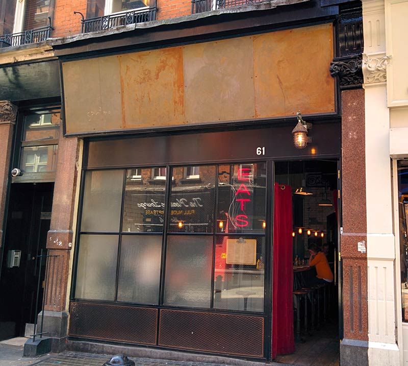
If you opt, like the vast majority of restaurant owners, for a clear statement of who you are and what you do, then the following is your essential guide to restaurant exterior design.
1.Exterior finish of a building
Your premises will in part dictate the finish of your restaurant exterior. If you have large glass windows, you have an in-built aperture into your restaurant. Passers-by will be transported inside and get a glimpse of the sights, smells and atmosphere they could experience. In the evenings glass facades offer the perfect advertisement for your establishment, casting an inviting glow onto the street.
If you are working with a building that has more render or smaller windows you will have to work harder with your signage to entice people inside and show them what good stuff you do.
If you are expanding your business with restaurants in several different premises you may end up with very different buildings. This requires careful designing to ensure your branding and interiors make it clear that you are part of the same chain. One of our clients, Turner’s Pies, has two very distinct sites yet clever use of other elements provides continuity and recognition (see below).

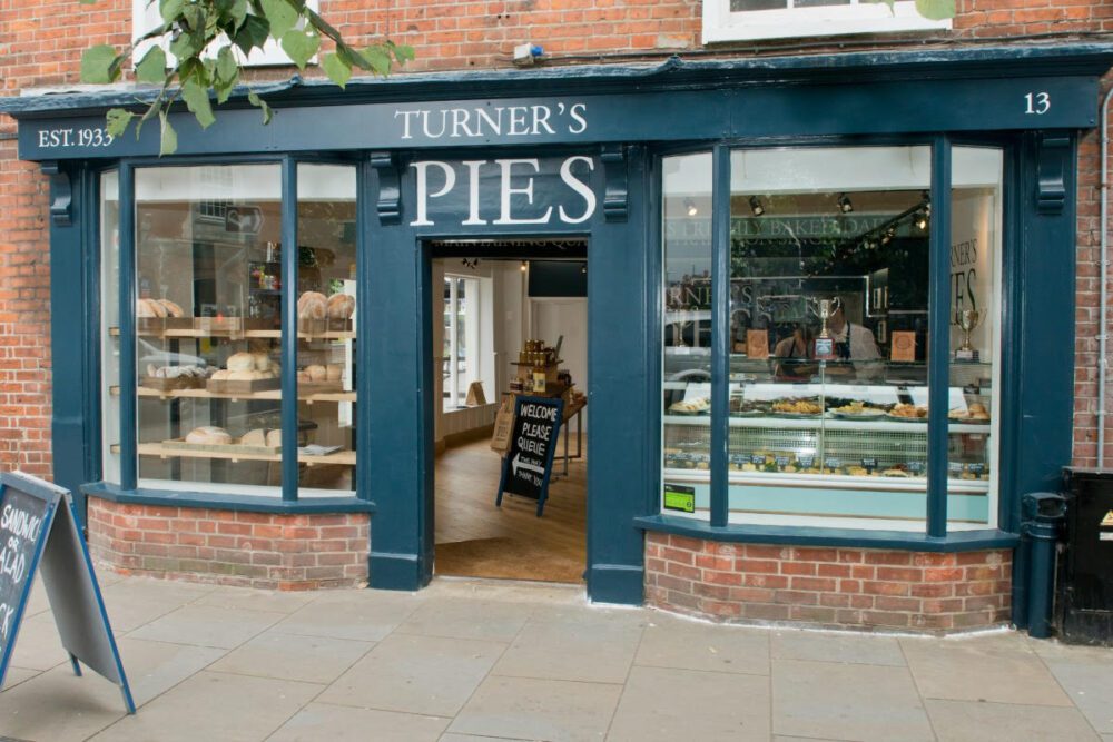
Your entrance will need to be inviting and welcoming, putting people at ease and making them feel as if they are stepping into your world. Your entrance tells customers how they will feel when they walk into your space and what sensory experiences they will have in your restaurant. Importantly, make sure your door is easy to open and that steps etc. are easily navigable. People need to get in!
2. Exterior Signage
Signage tells your story. It says more than just your name, it shows customers who you are and what you are about. Once you have worked out your branding, you need to consider how to implement your restaurant signage. Rather than positioning your signage so that it directly faces the front, it can be more effective to use a well-placed projecting sign. This is much easier to see from a close proximity, especially on a busy high street. Planners prefer projecting signs to explain what a venue does rather than just stating a name, so think about using symbols as well as words. Signs that show what you do have the advantage of instantly conveying what you can offer to people who may not know your brand.
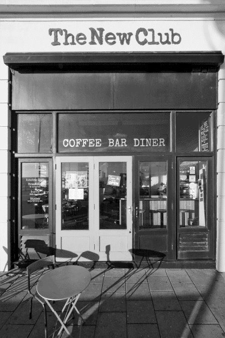
In our restaurant designs we try to draw the eye to signage by using it to highlight the walls on either side of a window. Fascia signage (above a shopfront) is great for establishing your main logo, but is subject to planning regulations. Some planning authorities and landlords have tight restrictions on fascia signage, so make sure you are clear about the regulations. These may determine whether you can have an internally or externally-lit sign. The New Club in Brighton (below) has clear fascia signage that conveys what they do and follows the typeface branding of their website and the menus inside.
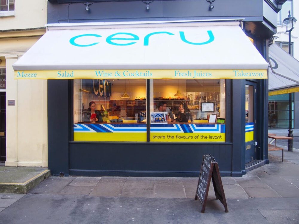
Awnings provide a fantastic opportunity to emblazon your signage in another place and increase the visual impact of your restaurant. Like in this example from Ceru, a pop-up restaurant we designed. The image demonstrates a main graphic on the body of an awning and smaller details on a valance. (Image by kind permission of Aftab Pathan).
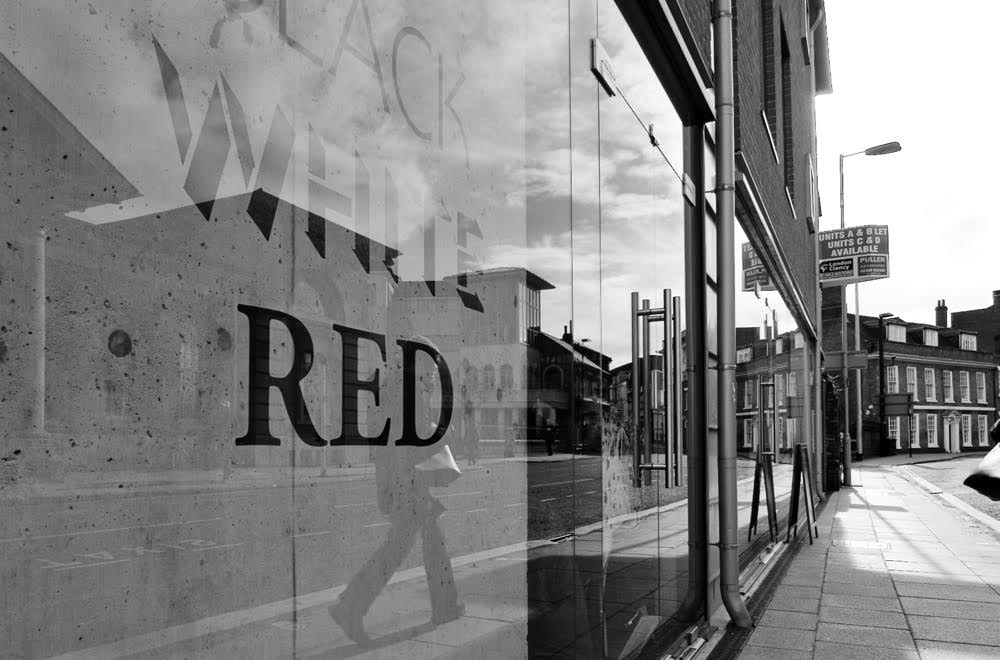
Vinyl signage can be applied to windows and is a good way to advertise to pedestrians. This is usually on a smaller scale to ensure it meets the eye of a passing person. You can use vinyl signage to describe what you do, rather than who you are. Or use an attention-grabbing graphic. Again, check whether you need planning consent for this. An example of vinyl signage can be found below, on our project Black.White.Red.
3. Exterior seating
Nothing says “We are a restaurant” like an external seating area. Sitting outside is part of a growing trend embracing a European-style café culture. To create the right people-watching space yet ensure that customers still feel secure, you can use windbreaks. Add some branding to these and you’ve got yourself another bit of advertising, as well as increasing the visual impact of your restaurant. External seating increases the amount of covers you can serve, and thereby increases potential income. Think about the type of seating you want: removable or permanent? Will you need to stack and store seating, or is there scope for weatherproof fixed seating?
Again, planning regulations may apply to exterior seating so check with the relevant council.
Hopefully this has outlined what to consider when planning the exterior of your restaurant design. Remember, the exterior is the first and last impression a customer will have. Make it good.
If you need further help or want to discuss any aspect of your restaurant interior design, get in touch.